Friday 22 January 2016

Logo research - 5 logos and information on them


  1. Starbucks logo. 
  • The picture is of a twin tailed mermaid, or siren with a crown on her head.
  • This siren is known as the heart of Starbucks. 
  • For people all around the world, she is the signal of the world's finest coffee.

  1. Wendy's logo. 
  • A little red head girl, her hair matches the Wendy's logo color. 
  • If you look carefully, you can see the word "mom" written on her collar. 
  • When Wendy's changed their logo, their font went from a "western-like" font to a hand written script font.  


  1. McDonald's logo
  • The golden arches in the M are the symbol of McDonald's. 
  • To me, the M looks a bit like two fries curved over to form an M. 
  • In 1960, these arches were introduced to the company as its new symbol.
  • Designed by Stanley Meston.
  • I think the designer of the McDonald's logo was very smart for creating such a simple yet creative symbol. When i see the logo, i immediately think of and crave their delicious fries. 

  1. Andriod logo. 
  • I think the andriod logo represents its company by the little green andriod. 
  • I have never seen any other brand draw as much positivity as the little green robot does for the platform. 
  • The robot was created by Irina Blok 
  • I really like the color chosen for the robot and the font they used for their logo, i think it represents the robot-like company perfectly and makes it so that you could see that this is a computer, techno, mobile devices company. 


  1. Google logo
  • The google logo appears in numerous settings to identify the search engine company. 
  • They are always coming up with new designs using all kinds of different pictures and colours, which i think keeps things interesting and gives people something to talk about. 
  • Google doodles go along with seasons, holidays, anniversaries, the lives of famous artists, pioneers and scientists. That along with random fun ideas they throw in there every once in awhile. 


Monday 11 January 2016

random info ~ soul bass


Saul Bass was born on May 8, 1920, in the Bronx, New York, United States, to Eastern European Jewish immigrant parents. He graduated from James Monroe High School in the Bronx and studied part-time at the Art Students League in Manhattan until attending night classes with György Kepes at Brooklyn College.
  1. He began his time in Hollywood in the 1940s, designing print advertisements for films including Champion (1949), Death of a Salesman (1951) and The Moon Is Blue (1953), directed by Otto Preminger. His next collaboration with Preminger was to design a film poster for his 1954 film Carmen Jones. Preminger was so impressed with Bass's work that he asked him to produce the title sequence as well. This was when Bass first saw the opportunity to create a title sequence which would ultimately enhance the experience of the audience and contribute to the mood and the theme of the movie within the opening moments. Bass was one of the first to realize the creative potential of the opening and closing credits of a movie.

Tuesday 5 January 2016

5 graphic designers

5 of the worlds top graphic designers 

  • Saul Bass
Saul Bass was a graphic designer and filmmaker, best known for his design of film posters and title sequences. During his 40 year career, Bass worked for some of Hollywood's greatest filmmakers, including Alfred Hitchcock, Stanley Kubrick, Billy Wilder, and Martin Scorsese. He became well known in the film industry after creating the title sequence for Otto's Preminger's, "The Man with the Golden Arm" In 1955.


  • Armin Hofmann 
Armin Hofmann is a Swiss graphic designer. He began his career in 1947 as a teacher at the Allgemeine Gewerbeschule Basel School of Art and Crafts at the age of twenand went on to study graphic design at Rhode Island School of Designty. 
  • Jessica Walsh
Jessica Walsh began coding and designing websites at age 11, 
and went on to study graphic design at Rhode Island School of Design. She teaches design and typography at the School of Visual Arts in New York, and is represented by Creative Artists Agency. 

  • Jon Hicks 
Jon Hicks
 is an English designer who owns his own design studio, Hicksdesign. Hicks is best known for rendering the Firefox logo into its final form, and has worked on numerous other design projects. 


  • Shigeo Fukuda 
Fukuda was a sculptor, graphic artist and poster designer who created optical illusions. His art pieces usually portray deception, like"Lunch with a Helmet on" on a sculpture created entirely from forks, knives and spoons that casts a detailed shadow of a motorcycle. 


Tuesday 24 November 2015

Butterfly Effect Notes

Butterfly Effect Notes:


The butterfly effect is a theory that a single occurrence, no matter how small, can change the course of the universe forever. I think this is kind of showing how little things can mean a lot, and, a very small event can cause a catastrophic change.

Some examples of this are:

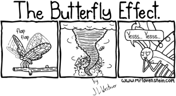
  1. While looking at some examples of the butterfly effect, i noticed the most popular example of this theory was how "the flap of a butterflies wings changed the air around it so much, it caused a tornado to break out two continents away."
  2. Another example of this the theory that, if you were to go back in time and change anything, it would change the future dramatically. Something so small as maybe accidentally killing a bug or stepping on a butterfly, could change the entire universe by the time you get back. 
With all these examples, we can clearly see that something so small that happens daily can effect a huge part of anyones day.
Through this i learned that everything we do really does matter.


+